Paperback dilemma
A few days ago I was thrilled to receive an advance copy of my next paperback, Too Damn Nice. It’s hard to explain how amazing it feels to see an actual book with your name on it, rather than a virtual book (which is a joy in itself). Somehow it makes the writing I do seem real. ‘Proper.’ I can’t actually read the words inside it, though. Like hearing myself talk, or seeing photos of myself, it feels weirdly embarrassing. And of course there’s always the fear I’ll see a typo.
But I can enjoy putting my hands on the book. Feeling it. Running my hands over the surface; the smooth cover and the embossed edges of my name, and the name of the book. All this brings me to my dilemma. How best to photograph my gorgeous book, to show it in its true light?
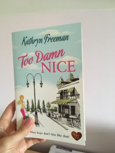
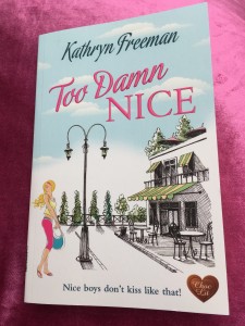
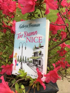
I tried just holding it, but all I could focus on was my thumb. I know, I thought, I’ll pop it on my favourite cushion (the one my family keep trying to hide, because apparently it’s too pink). But no, it looked, well, like a book plonked on a cushion. I was on a roll with the pink theme now though (there is some sense to this, as the title is in pink). Wouldn’t pink flowers would be a good backdrop? Inspired, I placed the book carefully next to my blooming azalea. Alas, it looks like a book that’s fallen into a flower pot.
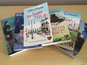
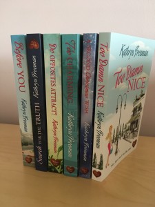
How about putting it next to other paperbacks. Yes, that worked…but I have a sneaking feeling if your name isn’t Kathryn Freeman, this won’t look quite so remarkable.
Finally, I went for the classic, and photographed it next to the bottle of fizz I’m saving to celebrate publication day with. It looks good … I meant the book, though obviously the wine has its own appeal.
But to really see how pretty the book is, you might have to order yourself a copy 🙂
